Basics of Mapping With OSM and QGIS 🗺️
A crash course
Why bother? (kyun-gis?)
Lazy summary: Maps give you a bird's eye view of things that you'll probably miss if you weren't looking. With QGIS you can analyze a wide range of data at various scales, including large-scale climate data, detailed satellite imagery, and granular street maps.
Prerequisities
Nothing.
Show me the goods
Here are some maps along with the data used to make them. All of this is publicly available data.
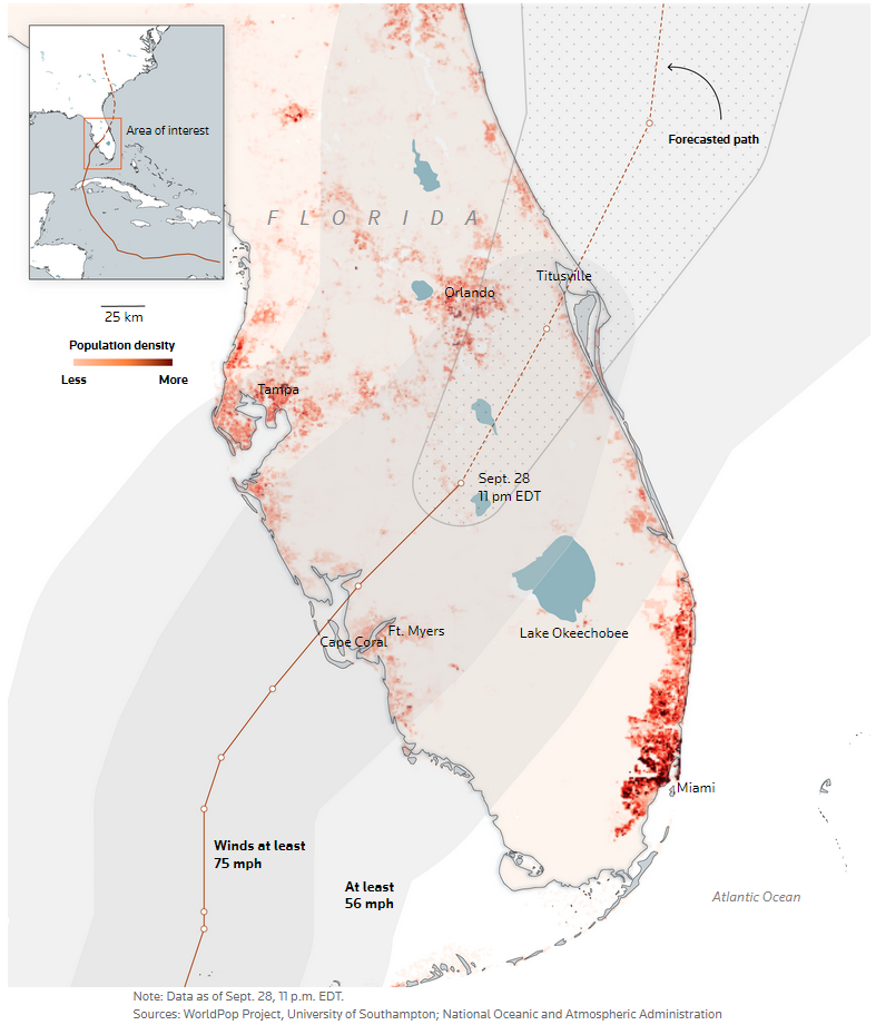
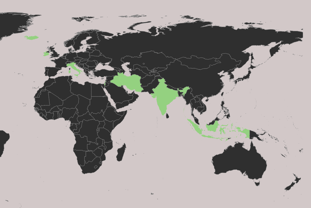
Hurricane Ian's Path
Data used:
- Shape of Florida in a vector format
- Population density information from an image
- Hurricane path in a vector format
- Water bodies locations in a vector format
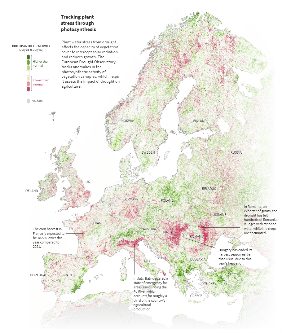
Visualizing droughts
Data used:
- Shape of Europe and country boundaries
- Photosynthesis data from satellite imagery
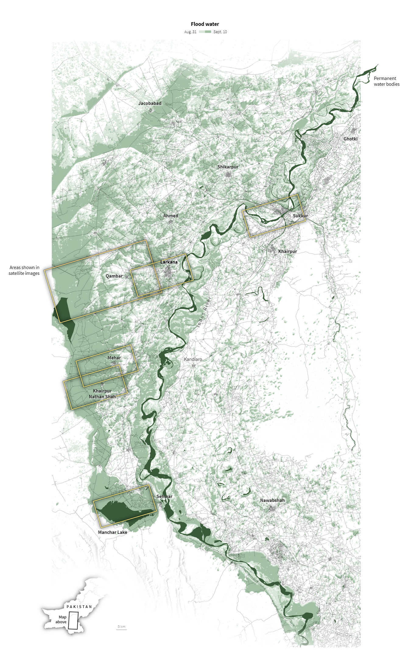
Pakistan Floods
Data used:
- Shape of Pakistan
- Permanent water bodies locations
- Openstreetmaps route network map
- Satellite water extent data
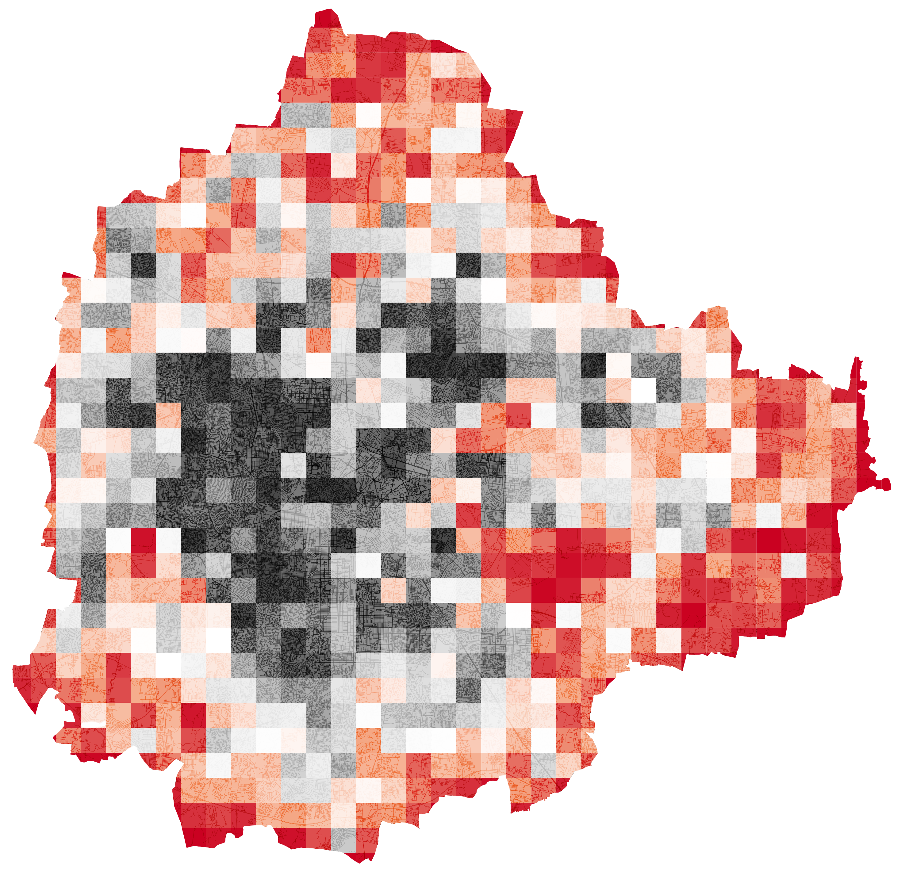
Mapping Walkability in Bangalore
A 1x1km gridded map of Bangalore showing walkability calculated using intersection density. More intersections means lesser block size, which implies easier walkability.
Data used:
- Bangalore boundary in a vector format
- OpenStreetMaps street network
Outline
We'll do this in four parts, after which will hopefully be comfortable enough to play with things on your own.
1.
Understanding QGIS basics with the world map
2.
Introduction to OpenStreetMaps
3.
Analysing Bangalore's wards and census data
4.
Exploring mobility through visualizations
PSA: There will be teeny, thodu sa, tiny, justalilbit of code/math.
I know code isn't everyone's thing and it doesn't need to be. You might see some things that look like code or weird numbers and percentages, but I promise, it isn't something you need to have learnt in 11th grade science. Get over that bar and it leads to pretty cool stuff.
I google my way through the simplest things (I've searched for ''1000000 in words". I am a fraud) even after 5 years of coding. No biggie, feel free to do the same.
Such sections are marked with 🥱
Part 1: Let’s Get It Started 🏁
The only stuff you need to care about
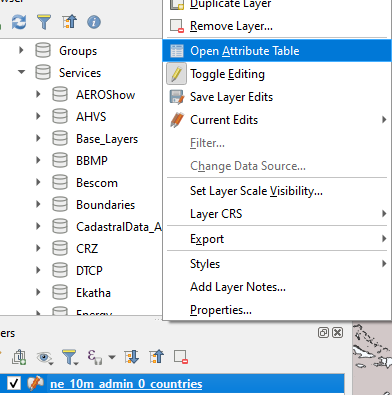
Fire up your copy of QGIS and let us explore the interface. QGIS can be overwhelming but we don't need everything it has. You'll be navigating between these sections for the most part.
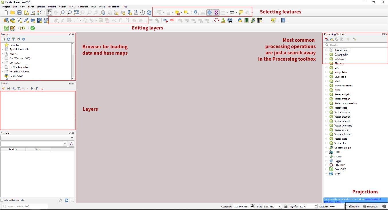
Load up your first map
There are many, many ways to get map files and they are of two types:
Raster - Made up of a grid of cells, where each cell represents a single pixel and has a value for a certain attribute, such as elevation or temperature. This is just like an image you'd export from Photoshop.
Vector - Made up of geometric shapes, such as points, lines, and polygons, which are defined by their coordinates and attributes. Vector files are typically used to represent discrete data, such as roads, boundaries. This is what you'd export from Illustrator.
Drag and Drop
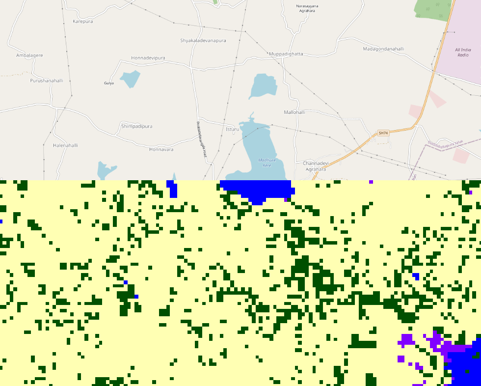
Download the two images in the raster folder. I've downloaded these from here, they show Bangalore as it looked like on 4th March.
Navigate to XYZ Tiles > OpenStreetMap in the Browser and click on it. Zoom into Bangalore.
Drag and drop the natural_color image into QGIS. Does it pop into place?
Now drag the scene classification image into QGIS too.
Troubleshooting Checkpoint 🧰
Did it work? Raise your hand if you can't see anything on your screen.
A place for everything, and everything in its place
You are now a geospatialinterlockingimages wizard.
Vector Data
This was raster data that had some geographical information, but what about vector stuff? The same stuff that Illustrator outputs can also be georeferenced.
Go to Natural Earth, download and unzip the Admin 0 countries file. What is inside?
🎵 Shape of You 🎵
You'll find a bunch of files in this folder. We only care about one, but here's what the others mean.
ne_10m_admin_0_countries.dbf- a database file containing attribute information about each country, such as its name, ISO code, and population.ne_10m_admin_0_countries.prj- a text file containing the projection information for the dataset.ne_10m_admin_0_countries.shp- the main shapefile that contains the vector data for the country boundaries, including polygons for land and islands.ne_10m_admin_0_countries.shx- an index file that links the attribute data in the .dbf file to the geometry data in the .shp file.ne_10m_admin_0_countries.VERSION.txt- a text file containing the version information for the dataset.
GIS Formats
Any time you come across a file that ends in:
.shp.kml.geojson- Georeferenced
.tif
means it is a GIS file.
All data within it is interlocked with specific coordinates, which means if you plop it into QGIS, it will show you exactly where you data is located on the earth's surface.
Drag and drop .shp file from Natural Earth into QGIS.
Troubleshooting Checkpoint 🧰
Did it work? Raise your hand if it didn't.
🎵 Top of the World 🎵
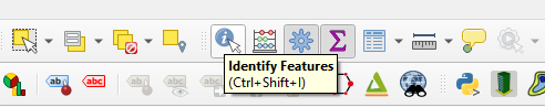
Click the Identify Features button and click on various countries to see what information this file has:
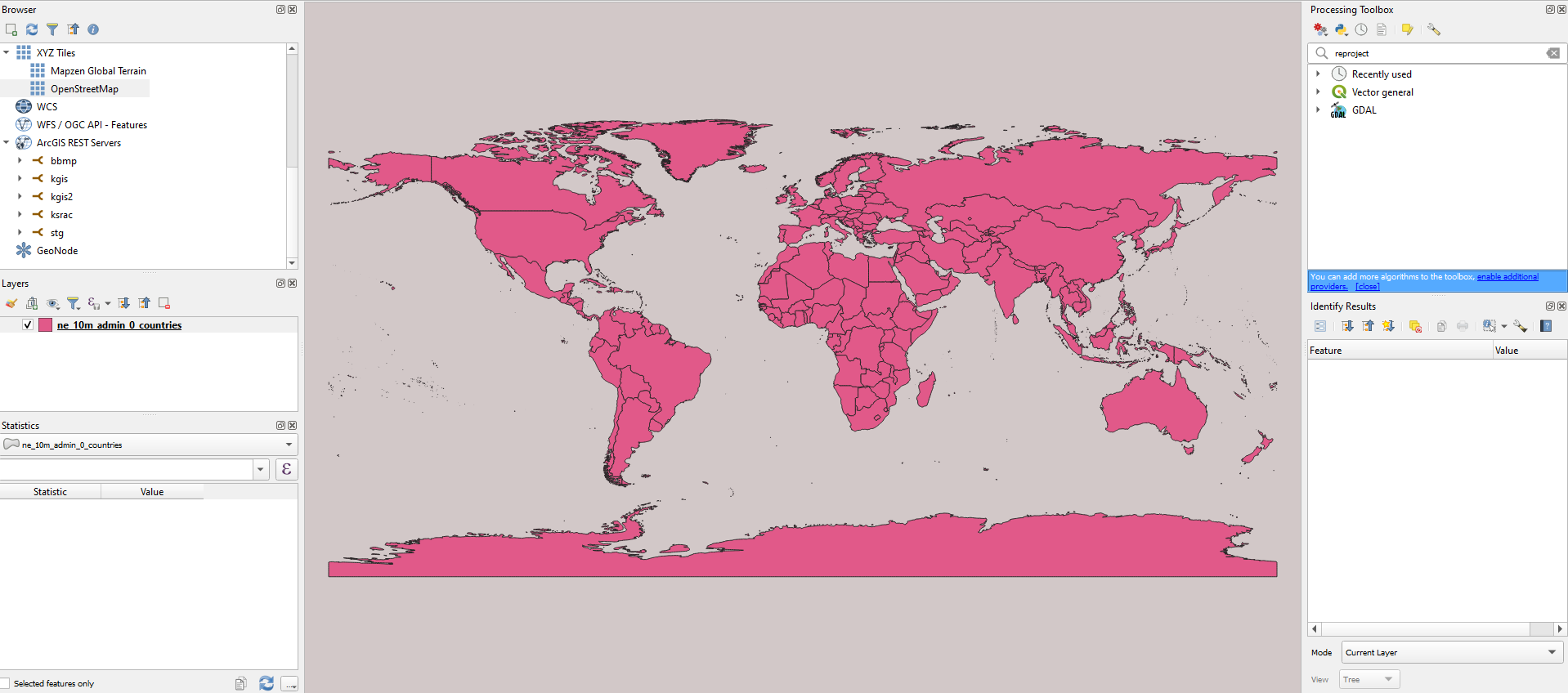
This will show up on the lower-right corner of your screen.
Making it look better
Double click on your world map layer and bring up the Layer Properties tab.
We'll have an overwhelming amount of terms and tabs again, but we only need to care about two of these tabs:
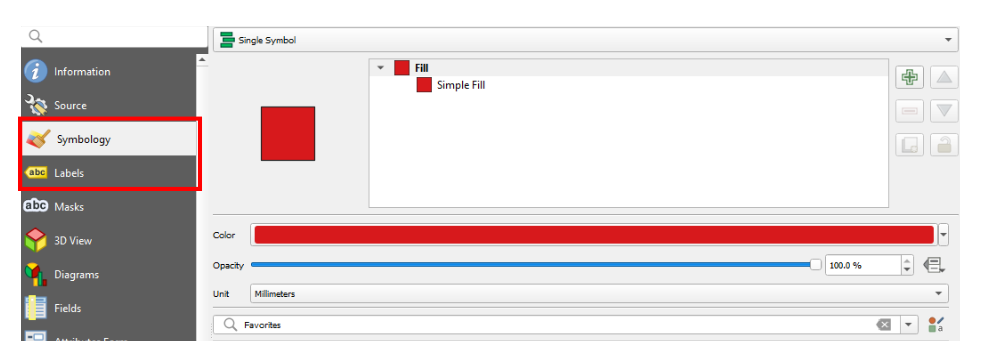
- Symbology controls how the map looks.
- Labels controls the text that you can display from the layer
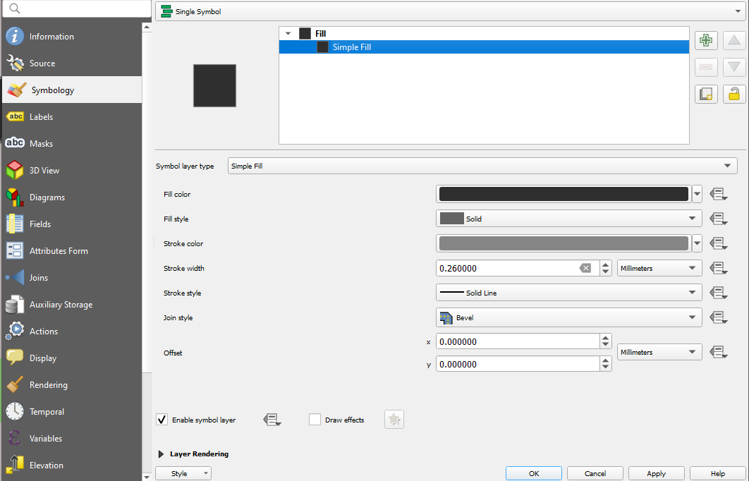
Symbology CheatSheet
Symbology will be your best friend, put those crazy graphic design skills to use here. Within symbology, you will mainly design things with these options. Here's when to use what:
Single Symbol - Displays all features in a layer with the same symbol. For example, you can use a single symbol to show all countries or buildings on a map with a red dot.
Categorized - Categorizes features based on a selected attribute, and assigns each category a different symbol. For example, you could categorize areas by land use and use different colored fills for each category.
Graduated - Displays features in a layer based on a selected attribute value range, and assigns each feature a symbol based on that value. For example, you could display population data as a series of shaded polygons, with lighter colors representing lower population and darker colors representing higher population.
Design Controls
Coloring by Categories
Inspect a feature to know what attributes are available to you. Which of these is a category?
Go to Symbology > Categorized
Choose a category you'd like to visualize.
Choose a color ramp. Since this is a categorical variable, what kind of scheme will you choose? Refer to the slide below 🔽 (press down arrow).
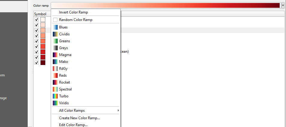
Click classify and the apply.
How do I choose a color palette?
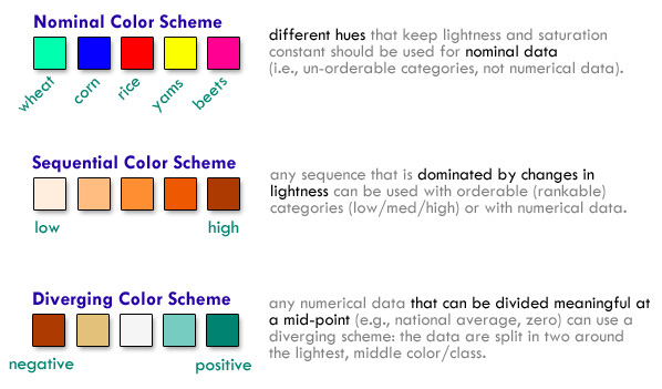
via morphocode
Everything is a database
All that you see in QGIS is essentially an Excel sheet. We can 'query' data the same way.
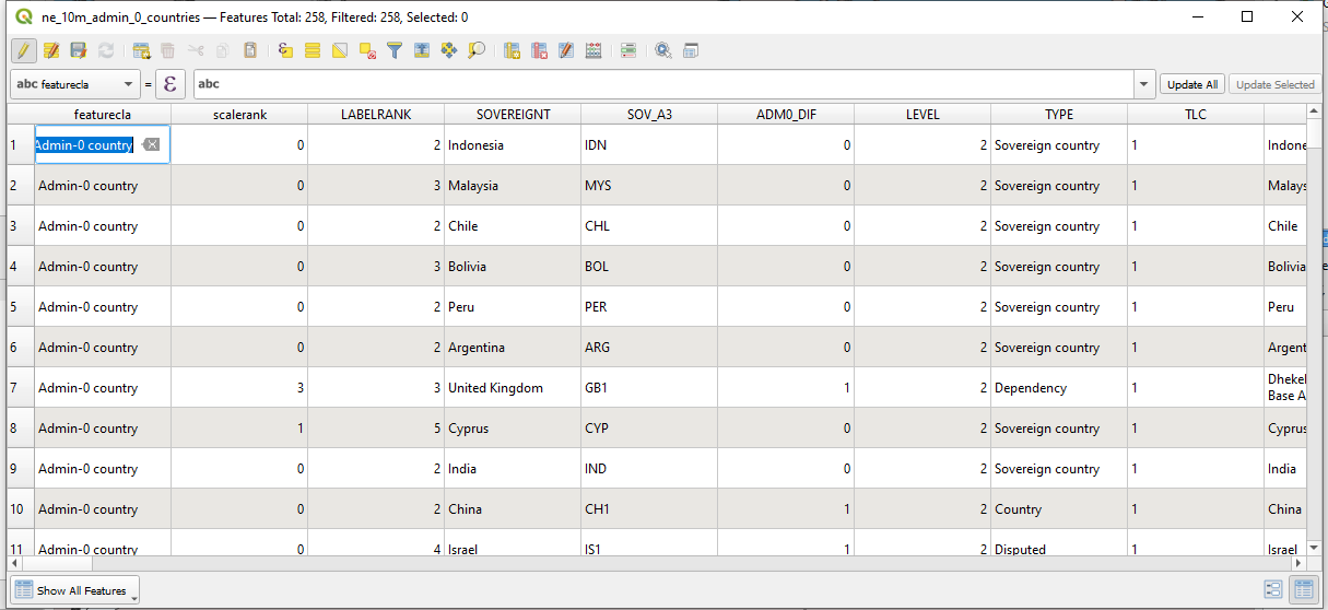
Wanna calculate areas of all countries?
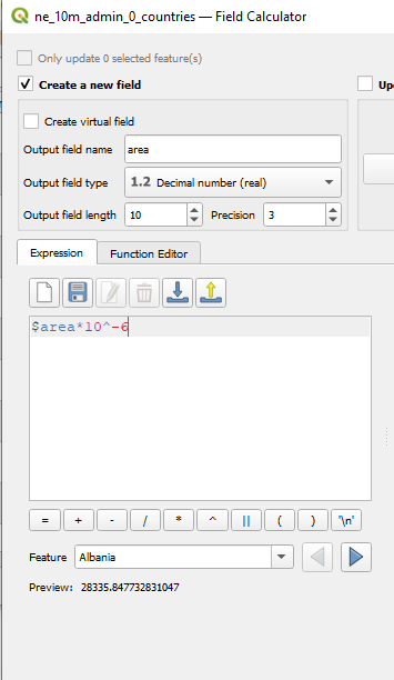
🥱 Basic calculations: Area
With the Attribute table open, click on Open field calculator.
- Click "Create New Field" and name it area.
- Set the output field type to decimal to preserve those juicy decimals.
- Type in
$areain the expressions window. - Observe the preview count for Albania. That's a huge number because it is in meters square. To convert it into km2, just multiple by
10^-6(0.0000001)
Go to the side below to see what your window should look like 🔽
You just had your first spatial data wrangling rodeo.
Now lets visualize countries with area greater than 40,000,00 km2 using Expressions.
Open Categorized Symbology again.
Click 'E' next to the Value tab and enter:
area > 4000000- Click classify again. Choose a set of colors for TRUE (1) or FALSE (2). Are you curious about what
Modeto use while classifying your colors? This is a handy guide - Apply
Excercise 1 - Making the Comic Sans of Maps
10 Minutes
Use a categorical or a numerical variable to make the ugliest choropleth map of the world you have seen. Use fills, change line strokes and souls of demons from hell. This is your graphicDesignIsMyPassion moment.
For the adventurous, you can get creative with your expressions! All of them are listed here.

Let's switch this up a bit
Have a break, use Stress Clicker™

Part 2: OpenStreetMaps - its osm 😎
OSM is the Wikipedia of maps
People like you and I contribute everything that OSM has. OSM is used everywhere from Instagram and Facebook to Amazon.
Thanks to our juniors, Srishti has a small but pretty active mapping community (and we'll see this in action later).
Parts of OSM
1. Nodes
Points on the map, like markers, buildings, points of interest.
2. Edges
Lines on the map that connect things together, like roads, rivers, rail networks etc.
3. Relationships
Well, literally relationships. Bangalore is a city within Karnataka. That is a relationship.
OSM is very well documented. Lets explore that.
Go on, select stuff.
Head over to OSM to poke around our neighbourhood
Use the select query button to poke around and select a point.
Once you do, OSM loads up a list of features in that area.
Each item is tagged and annotated
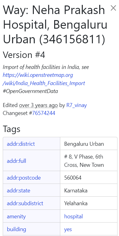
Try selecting Neha Prakash and see what the sidebar says.
Notice the level of categorization. It lists out whether it is a building, whether it is a private or a government hospital and even the name in Kannada. You can see who added it and who verified it too.
Overpass Turbo Time
The 'API' that people use to fetch data from OSM is called Overpass. It is incredibly simple to use thanks to Overpass Turbo, which allows you to build queries.
Building a Query
First, look around on OSM's inteface for what you want to locate. Toilets? Metro stations? Shops? Just click around for a sample of what you need (or you can google what OSM refers to it as) and examine the tags.
I'm going to search for toilets in Bangalore. A quick search on Google tells me OSM categorizes it under
amenity.Open up the Turbo query wizard. This is what I typed in:
amenity=toilets in Bangalore 4. Click run.
Exercise 2 - Gimme Gimme Gimme
8 Minutes
Play with some queries in Turbo. Here's a few to get you started.
Metro lines and stations:
operator:BMRCL and subway=yes in BangaloreRestaurants in Bangalore
amenity=restaurant in BangaloreFoot bridges in Bangalore
highway=footway and bridge=yes in BangaloreLakes in Bangalore
natural=water in BangaloreExporting from Turbo
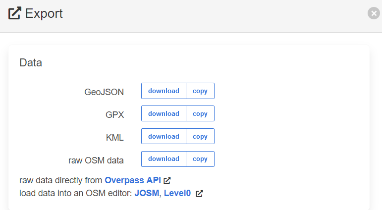
Once you're settled on what you want to visualize, click Export on the top bar.
This brings up a dialog with the usual suspects. Choose GeoJSON. Drag-and-drop the downloaded file and drop it like its hot.
What is it good for?
Here are some great projects which use OSM and population data to generate useful insights:

Part 3: Zooming into Bangalore 🔎
Asking the right questions
Over the next few slides, we'll learn a bunch of stuff.
- Constructing voronoi polygons to visualize proximity.
- Computing simple statistics with census data.
- Creating choropleth maps with census data.
- Visualizing BMTC routes.
- Drawing isochrones for a point.
While all of these may seem disconnected, what they are doing is helping you build a profile of the area within which you are working.
The idea is to understand the area in as much detail as we can so our research is sufficiently specific. The data is there, it is on us to see how we can wrangle it to answer our questions.
Loot box
I've compiled datasets that might be most useful your research here. These include road networks, landuse maps, population data and more. Take a gander:
5 Minute Breather - Go through these files and the Notion Board. Download and unzip files in Drive and keep them in a folder.
About Each Dataset
bmtc_routes.gpkg: Bus routes (calculated by geohacker) across Bangalore with information such as number of trips, origin/destination.bangalore_wards.gpkg: Ward boundaries and kickass 2011 census information for each ward. Also contains household asset survey information via KSRAC. ✔️osm_bangalore_buildings.zip: All buildings within Bangalore via OSM. ✔️osm_bangalore_roads.zip: All da roads within Bangalore via OSM.traffic lights.gpkg: Traffic light locations within Bangalore via KSRAC. ✔️ghsl_population.gpkg: Updated number of peeps layer for 2015 via GHSL. ✔️metro lines.geojson: Metro lines and stations via OSM.✔️existing_landuse.zip: Vector, georeferenced and sexy af landuse map via KGIS ✔️
✔️ denotes official source.
Load in your files
Open up a new QGIS project and load in the default OSM layer. Drag and drop the following files into the project.
bangalore_wards.gpkgosm_bangalore_roads.shposm_bangalore_buildings.gpkgbangalore_bus_stops.shp
Turn all layers other than wards invisible, otherwise your laptop might spontaneously combust.
Exploring the 2011 Census Data
Select any ward and have a look at the attributes and values. What are they telling you?
You can have a look at the variables and what they stand for by going through this sheet, I've labeled it for a single ward.
Take a few minutes to look at the columns
Exercise 4 - You can't handle the truth
20 Minutes
What variables are most interesting to you? Based on these variables, what are the questions you can ask?
Example Question: What are the wards with high working female population?
How would you visualize this? Choose a nice color scheme and make it look pretty. Can you also play around with the labels tab to add Ward Names to your map? What about adding a rule to only display label if the population is above a certain number?
Example Questions
What are wards in Bangalore where the female population is more than the male population?
Ward data layer > Symbology > Rule Based > Add Expression > Paste:
TOT_F11 > TOT_M11Which ward has most people that are without cars?
Ward data layer > Symbology > Graduated > Choose 'Households with Cars' > Invert Color Ramp to highlight lower values
Export it!
We've been creating stuff for a while, let's save the last map we made.
- Go to File > New Print Layout and enter a name.
- Insert your map by locating the 'Add Map' icon in the left toolbar.
- You can change the page layout and the map scale/zoom in the item properties tab:
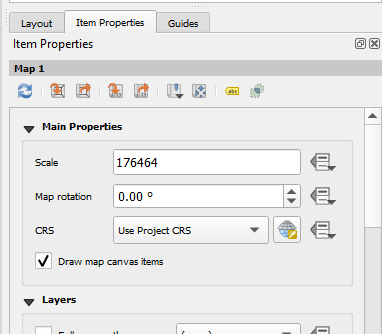
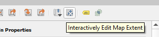
- By default, the scale is set by whatever zoom level your canvas had. I recommend that you select
Interactively Edit Map Extentto zoom and pan around to set it permanently.
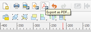
Add the Paraphernalia and Ship
Your map should include:
- Scale
- Legend
- North pointer
Locate these within the toolbar on the left and position them on your page. Once done, export your map as a PDF.
I recommend these options 🔽
Export Options
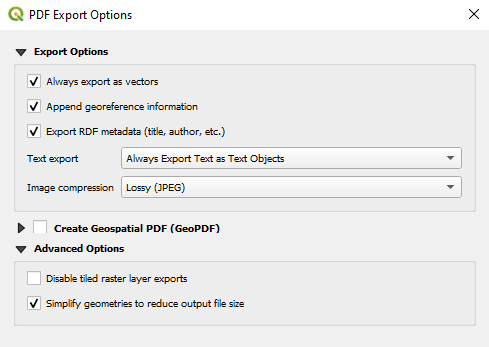
Key Points:
- Export as vectors, so you can edit the lines and shapes in Illustrator later.
- Export text as text objects so you can change the fonts later.
- Simplify geometries.
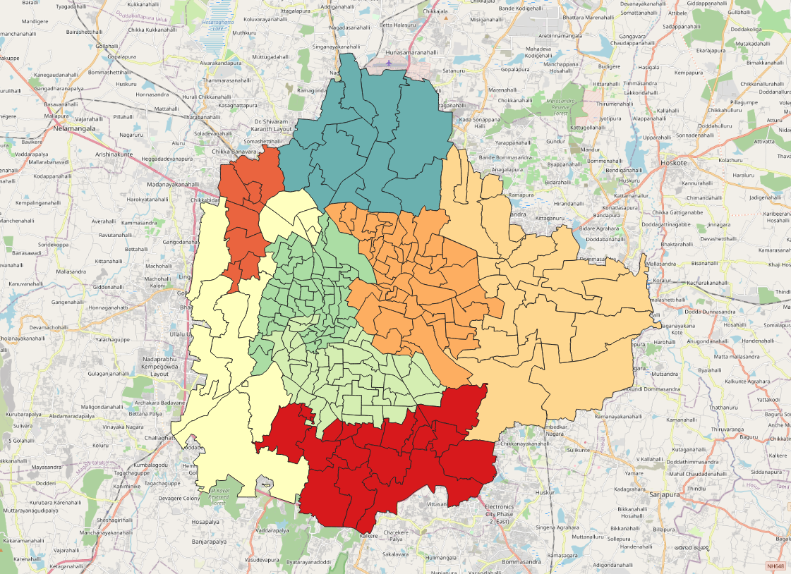
Choose a zone
Remember how we colored the countries based on the continent? Do the same thing for wards and color it by the categorical variable ZoneName, just to see what zones are there in Bangalore. Pick a zone you want to work with.
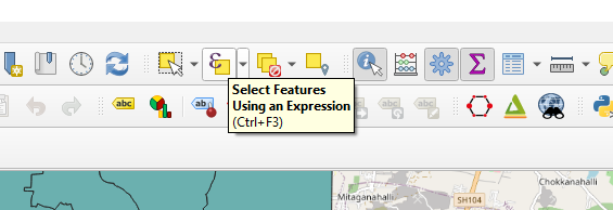
Select your zone
Locate the Select using an Expression icon, it might be a dropdown item. Once done, enter ZoneName = 'YELAHANKA' (replace with your ZoneName)
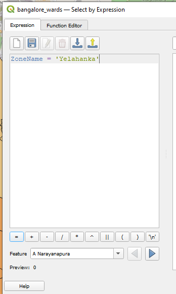
Your selected features will be highlighted in yellow.
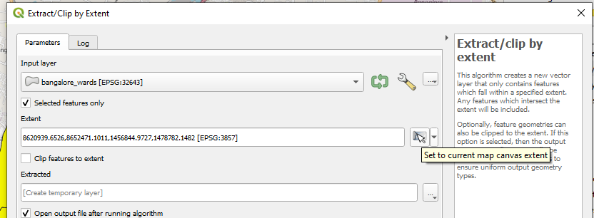
Extracting Features
In the Processing Toolbox, search for 'Extract'. Since this is a vector layer, we'll only look at tools under the vector heading.
- Click
Input Layerand selectBangalore Wards - Tick
Selected Features only - In the
Extentfield, click on the dropdown and selectCalculate from Layer Extent'>Bangalore Wards` - Click Run.
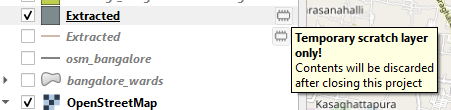
Everything in life is temporary. Especially these layers
Any time you process a layer, a new one is created and it is temporary. This means if you close your project, this will be gone. Click on the icon and save it to a new location.
Now you're safe.
Rename your layers for organizational purposes.
Tunnel Vision
Now that we have our area of interest extracted, time to limit our road network to this area too. Here's how to do that.
- Search for
Clipin the Processing Toolbox.
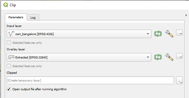
There are two fields here.
Input Layer: What you want to clip.
Overlay Layer: What you want to clip it to.
Exercise 3 - Snip Snip ✂️
Let us clip the bus stops and buildings to this zone too. Remember to save all layers so that none of them are scratch disk layers.
Part 4: Visualizing Mobility 🚌
🛑 You have reached the point where I started feeling sleepy. Slides beyond this point are minimal and like this horse's latter half. 🛑
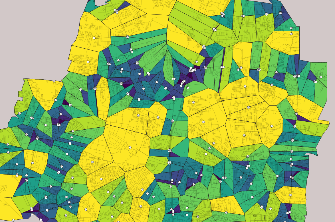
🥱 Understanding Proximity: What area is each bus stop closest to?
Now that we have bus stops clipped to our area of interest, we can ask it some interesting questions. For example, what are the areas furthest from bus stops in this zone?
We can answer this question with the help of voronoi polygons. But I'll let them do the talking. First, locate Voronoi Polygons in the Processing Toolbox.

Select the input as the bus stops layer and set a buffer extent of something like 10% (so that it extends it beyond the Zone area if needed). Click run. What do you get?
How can we visualize these regions?
This is a good example of when you need just a little more information to make this informartion make sense visually.
Calculating Pedsheds
OpenRouteService helps in drawing pedsheds, which answer the question of how a person can travel on foot from a specific location within a given amount of time.
Pedestrian routing algorithms in ORS take into account factors such as terrain, road networks, and pedestrian infrastructure to determine the most efficient route for a person to travel by foot.
Setting up ORS
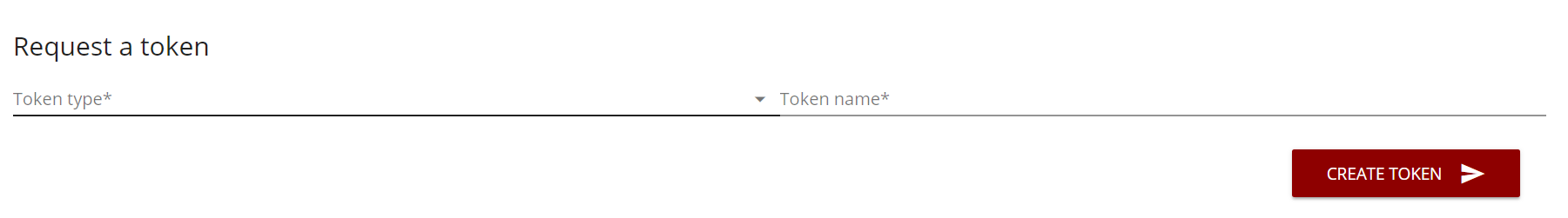
Hopefully, you've created an account. Please login and then visit this link
Select Standard for token type and enter some name.
🔽
Downloading the ORS Plugin
- Go to the "Plugins" menu.
- Select "Manage and Install Plugins" from the dropdown list.
- In the Plugins dialog box, search for "ORS Tools" using the search bar on the right-hand side.
- When you find "ORS Tools", select it and click the "Install Plugin" button.
- QGIS will download and install the plugin for you. Once it's finished, close the Plugin dialog box.
- You should now see a new toolbar called "ORS Tools" in your QGIS interface.
🔽
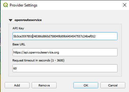
- Click on the "Settings" button on the ORS Tools toolbar.
- In the ORS Tools Settings dialog box, click on the "Authentication" tab.
- Enter your API key in the "API Key" field and add
https://api.openrouteservice.orgfor Base URL.
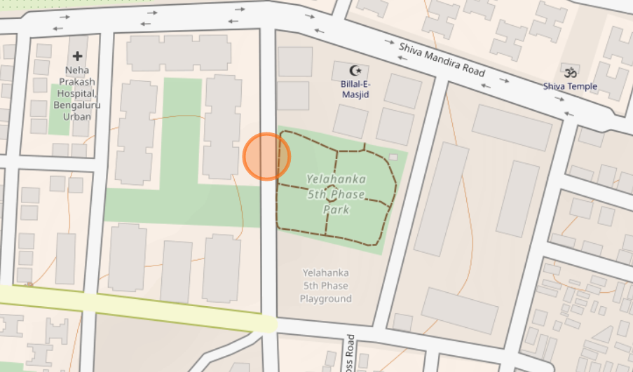
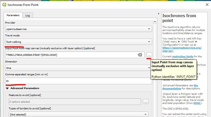
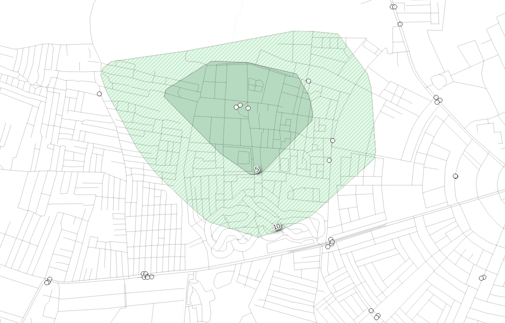
What are the areas around 5th Phase bus stop that are within 10 and 15 minute walking distance?
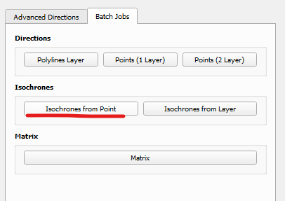
- Click on OpenRouteService on your toolbar.
- Select
Isochrones from Point
🔽
- Select Travel mode as
foot-walking - Click on
...in the Input field and locate a point on your canvas - Set the time range you'd like to find. 15 minute means finding areas which are 15 minute walkable within that point. This can be multiple (5, 15).
- Click run.
Walkable areas around 5th Phase bus stop
Mapping Land Use
How is your site distributed within itself? How much of it is residential land and how much of it is commercial? Land use maps help answer that question.
Land use maps are usually available as PDFs but trying to use those is like scraping plastic from a frying pan.
I've made it available to you as a shapefile, download and put it into your QGIS project.
What does the landuse in your area look like?
Using the clipping and extracting skills you just learnt, crop the landuse layer into your area of interest and color it categorical (which variable is denoting the type?). Refer to this legend for clues on what letter refers to what land use type:
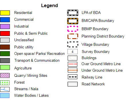
Land Use in Ejipura
Better than that crappy PDF right?
Intense Bus Route Maps
You know the drill.
Drag, drop, pick features and view. This file contains some interesting features such as route number, number of trips, distance travelled and origin/destination stations.
You can query some fun stuff.
Which buses start from 5th phase and what is the farthest that I can go?
Bus Routes Layer > Symbology > Rule Based > Add Expression > Paste:
origin = 'Yelahanka Satelite Town 5th Phase'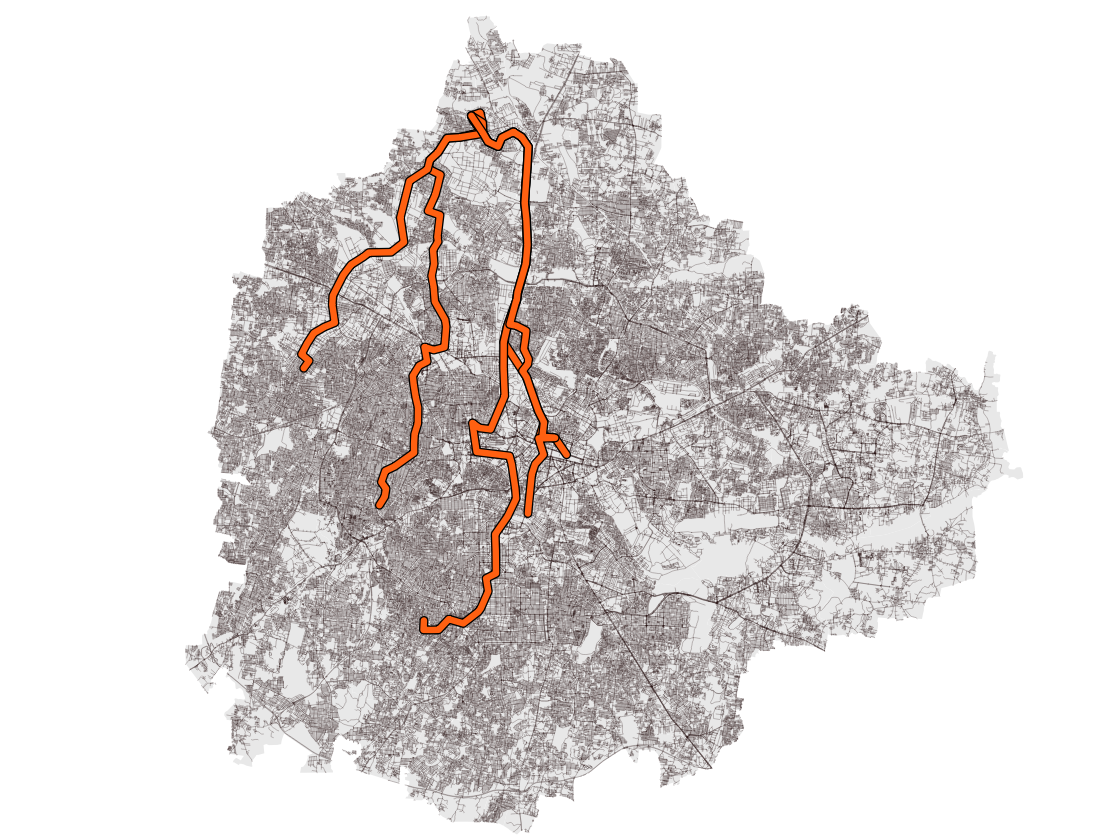
Alright, I've bored you enough
What are you planning on doing with these datasets?

See you